
On this page
Twelve cabinet colours in the same kitchen
In October 2026 we took one kitchen and changed only the colour of the cabinets. The room, the light, the oak floor and the white worktop stay the same, so the colours are easy to compare. Every other part of the picture is identical.
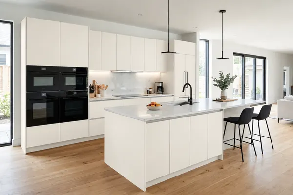
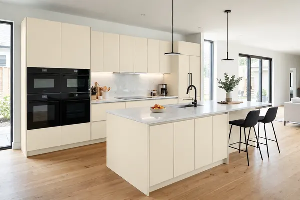
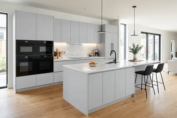
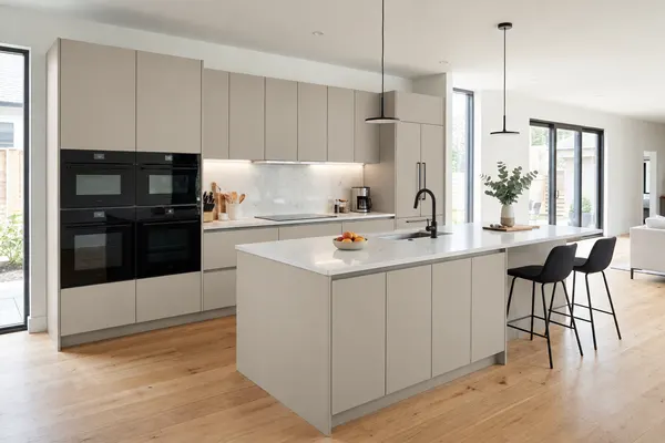
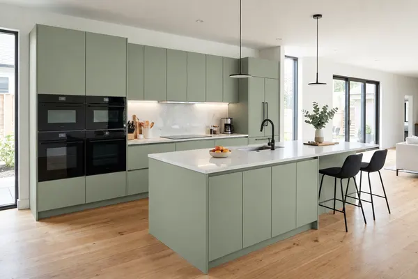
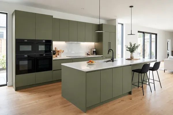
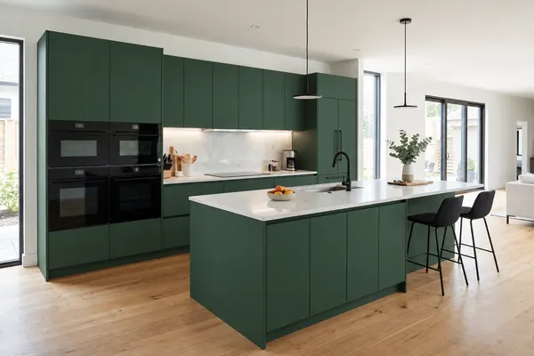
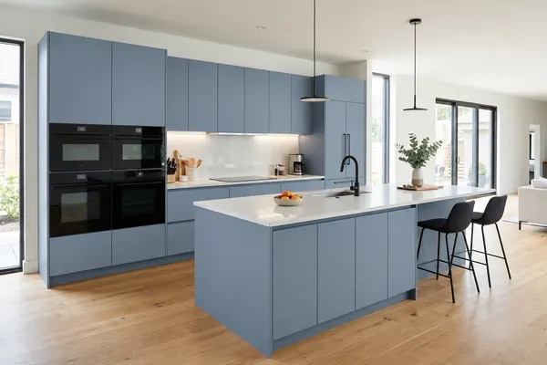
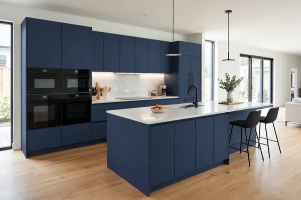
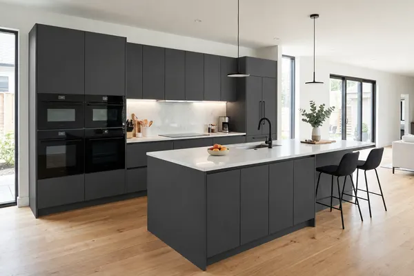
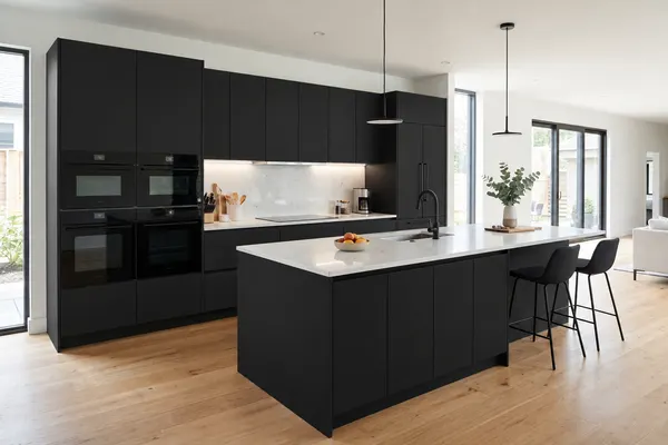
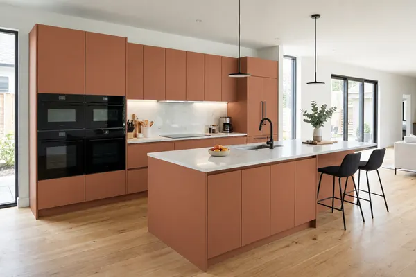
We made these images with BTTR Space from one starting kitchen. Screens show colour in different ways, so always check a real paint sample before you choose.
Warm white, cream and greige keep a kitchen light
Light colours reflect more light back into the room. Paint makers measure this with LRV, a scale from 0, which absorbs all light, to 100, which reflects all of it. A high LRV means a colour reflects a lot of light.
In our kitchen, warm white and cream make the room look brighter and let the oak floor stand out. Light grey looks cooler and a little more modern. Greige sits in between: it is warm like cream but hides less of the shape of the cabinets.
These are the safest choices if you are not sure, if the kitchen is small, or if you plan to sell. They also leave room for colour elsewhere, such as a full-height backsplash or bold stools.
Sage, olive and forest green bring colour without shouting
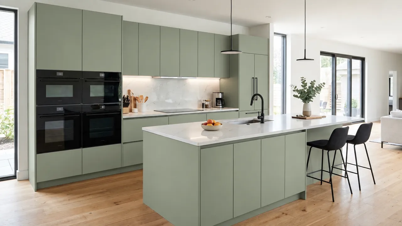
Green is the colour that changes this kitchen the most while still looking calm. Sage is soft and grey, so it sits quietly next to wood and white stone. Olive is deeper and earthier. Forest green is rich and dark, and the white worktop keeps it from feeling heavy.
All three work with an oak floor because green and warm wood look natural together. If your floor is grey or white, sage and forest green still work, but olive can look a little dull.
If you like green but feel unsure, try it on the island only and keep the wall cabinets light. Our kitchen mood board guide shows how to test one bold choice against the rest, and our style inspiration guides cover the other finishes.
Dusty blue and navy work best with light around them
Dusty blue is a light blue-grey. Next to the oak floor it looks calm rather than cold, and it suits a bright room that faces the garden.
Navy is strong and classic. It looks smart with a white worktop and white walls, but it takes light out of the room. In a darker kitchen, use navy on the island or the base cabinets and keep the wall cabinets light.
Charcoal, black and terracotta need a calm room
Charcoal and black are the boldest choices here. They make the white worktop and the oak floor stand out, and the black ovens and handles seem to disappear. They also reflect little light, so the room can feel smaller.
Add light to balance them: lights under the wall cabinets, a pale worktop and pendants over the island. Our guide to pendant height over an island helps you place them.
Terracotta is the surprise. It is warm and unusual, and it works when the floor, worktop and walls stay simple.
Match the colour to your floor, worktop and light
Start from what you will not change. The floor, the worktop and the daylight decide which colours look right.
| What you have | Colours that work | Test first |
|---|---|---|
| Oak or warm wood floor | Cream, sage, olive, forest green, navy | Light grey: it can look cold next to warm wood |
| Grey or white floor | Warm white, light grey, dusty blue, black | Olive: it can look dull |
| White stone worktop | Every colour here, from warm white to black | Very pale colours: little contrast with the worktop |
| Small or dark kitchen | Warm white, cream, greige, light grey | Black and navy on every cabinet |
| Bright, open kitchen | Forest green, navy, charcoal, terracotta | Nothing: most colours work with good light |
Source: our 12 versions of the same kitchen above, made with BTTR Space. Checked 29 October 2026.
How to choose your cabinet colour in five steps
- Write down what stays: the floor, the worktop, the tap and the handles.
- Look at your light. A dark or north-facing kitchen suits the lighter colours; a bright one can take dark colours.
- Pick three colours from the 12 above that suit your floor and worktop.
- Paint a large sample on a board and look at it in the morning and the evening. White paints in particular change tone through the day.
- See the new look in your own room: start with one photo of your kitchen and compare styles before you buy.
If you are still choosing the layout, read which kitchen layout is best first: colour is easier once the plan is fixed.
Common problems with cabinet colours, and how to fix them
Most colour mistakes come from testing a sample that is too small or ignoring the light in the room.
| What you see | Why it happens | What to do |
|---|---|---|
| White cabinets look cold or blue | A cool white in cool daylight | Choose a warm white or cream and test it next to the worktop |
| The kitchen feels darker than before | Dark colours reflect little light | Keep the wall cabinets light and add lights under them |
| The colour looks different at home | The light changes through the day | Test a large sample in the morning and the evening |
| Green looks muddy | A deep green next to a grey floor | Try sage or forest green instead of olive |
| Every surface fights for attention | A bold colour plus a bold worktop and backsplash | Keep one bold choice and make the rest calm |
Source: Sherwin-Williams and Benjamin Moore on light reflectance and white paints; our 12 versions above. Checked 29 October 2026.
Quick questions
- Are white kitchen cabinets still a good choice?
Yes. White and warm white suit almost any floor and worktop and keep a kitchen light. Choose a warm white if your kitchen gets cool daylight, and test it next to your worktop.
- Do dark cabinets make a kitchen look smaller?
Yes, they can, because dark colours reflect less light. Keep the worktop and walls light, add lights under the wall cabinets, or use the dark colour only on the island or the base cabinets.
- Can you mix two cabinet colours in one kitchen?
Yes. A common way is a darker colour below and a lighter one above, or a coloured island with lighter wall cabinets. Two colours that are both warm or both cool sit well together.
- Is green a good colour for kitchen cabinets?
Yes. Sage and olive look calm next to oak floors and white worktops. Forest green is richer and works best in a bright kitchen with a pale worktop.
- Should the cabinets match the walls?
Not usually. Most kitchens look better with a little contrast: light walls with coloured cabinets, or a soft wall colour with white cabinets. Matching both can make the room look flat.
How we check
We take every clearance from published planning guidelines and manufacturer guides, and record the page and the date we checked it. Our examples are drawn to scale from the dimensions they state. They are planning examples, not approvals for installation: services, fixings and local rules need your designer or installer. Our editorial policy.
Sources2 published guidelines and guides behind this page
Numbered in order of first use.
- Worthy of Reflection, Sherwin-Williams. Checked 29 October 2026.
- The Ultimate Guide to White & Off-White Paint Colors, Benjamin Moore. Checked 29 October 2026.
The 12 kitchen images are illustrations made with BTTR Space from one starting kitchen, changing only the cabinet colour. Screens show colour differently, so check a real paint sample. The notes on each colour are our own view of these images.